Edik Ghabuzyan
Welcome note from the conference curators
Event
| Time | Programme | Speakers |
|---|---|---|
| Armenian Study Trip | ||
Armenian Study TripAbstractSo this is Paradise Lost! Noah’s Ark landed on Mt. Ararat, the holy mountain of the Armenians. Here, in the city of Yerevan, many important caravan routes intersect: the country of Armenia is a geographic, cultural and political crossroads between Europe and Asia, between Christianity and the world of Islam. |
||
| Time | Programme | Speakers |
|---|---|---|
Opening Exhibitions and Guided Tours |
||
Welcome note from the conference curatorsAbstractWelcome note from the conference curators |
||
Greeting notes |
|
|
The Armenian alphabet |
||
About the GRANSHAN history |
||
Announcement of the GRANSHAN Competition Winners 2017 |
||
Calligraphy Performance on the occasion of 10 years GRANSHAN »Living Letters«AbstractCalligraphy Performance on the occasion of 10 years GRANSHAN »Living Letters« with |
||
Closing note |
| Time | Programme | Speakers |
|---|---|---|
Welcome Note |
||
Greek type and typography |
||
Hangul, the living letters |
||
Georgian typography |
||
Tricky Cyrillics |
||
Living letters: living cultures |
||
Why sometimes it doesn’t feel like “Persian”?! |
|
|
The design brief |
||
Closing notes |
||
| Session Cyrillic | ||
Alexei Vanyashin |
||
Ilya Ruderman |
||
Kyrylo Tkachov |
||
Panel Discussion |
||
Todor Vardjiev |
|
|
| Time | Programme | Speakers |
|---|---|---|
Welcome Note |
||
Art and design education |
||
The Georgian script |
||
Tricky Variable Fonts |
||
Typography for Johannes Bobrowski |
||
AREK AND TUMO |
||
TWO HEARTS |
||
Armenian GRANSHAN Competition winners of the last yearsAbstractArmenian GRANSHAN Competition winners of the last years |
||
Hangul typeface projects for commercial use |
|
|
Closing notes by the curators |
||
| Armenian Session | ||
About Calligraphy |
||
Davit Ghazaryan |
||
Tigran Sosoyan |
||
Welcome note from the conference curators
Welcome note from the conference curators
Welcome note from the conference curators
About the GRANSHAN history
Calligraphy Performance on the occasion of 10 years GRANSHAN »Living Letters«
Calligraphy Performance on the occasion of 10 years GRANSHAN »Living Letters«
Calligraphy Performance on the occasion of 10 years GRANSHAN »Living Letters«
Georgian typography
Tricky Cyrillics
Alexei Vanyashin
Ilya Ruderman
Kyrylo Tkachov
Living letters: living cultures
The design brief
Art and design education
The Georgian script
Typography for Johannes Bobrowski
Davit Ghazaryan
Tigran Sosoyan
AREK AND TUMO
TWO HEARTS
Armenian GRANSHAN Competition winners of the last years
Armenian GRANSHAN Competition winners of the last years
Armenian GRANSHAN Competition winners of the last years
Armenian GRANSHAN Competition winners of the last years
GRANSHAN conference is complemented by a number of exhibitions: ATypI’s Letter2 exhibitions, GRANSHAN’s 2016 competition winners, TUMO students’ work, a group calligraphy project by Ruben Malayan as well an exhibition by the Association of Georgian Typefaces.
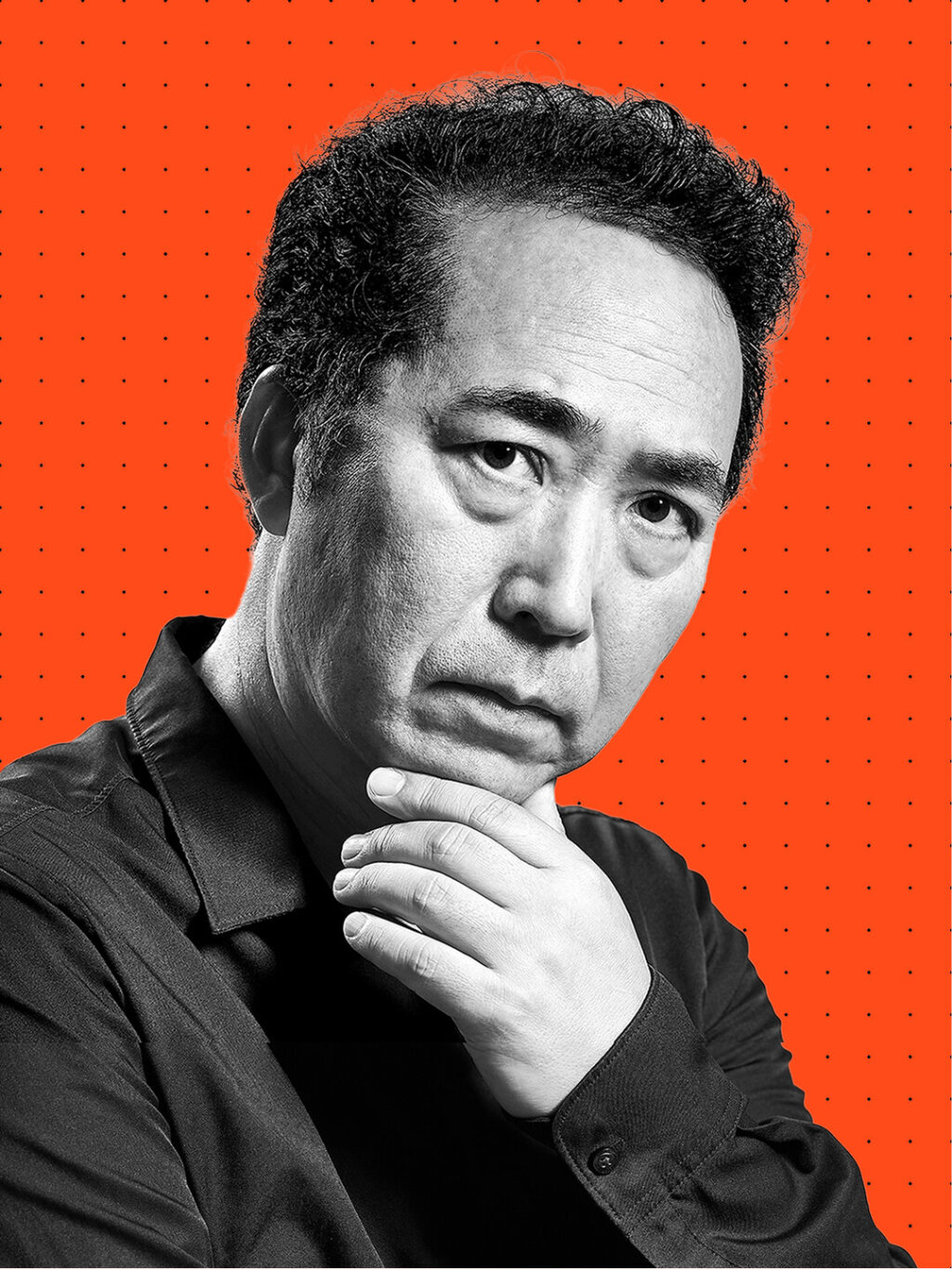
We dive right into the subject of the Armenian script with Edik Ghabuzyan’s keynote presentation. 10 million people globally, 3 million of them in Armenia, share this alphabet – it is an integer part of the Armenian identity.
Angela Poghosova is giving an overview over the ten year history of GRANSHAN: From it’s beginnings as a type competition in Armenia to an organisation promoting non-Latin type and typography on a global scale today.
During the last two days, the GRANSHAN jury came together to assess this year’s submissions, to consider the experts feedback and to discuss the works. And now Edik Ghabuzyan and Boris Kochan announce the winners of the 2017 competition: We would like to congratulate all the winners – well done!
In Yerevan, Armenia the GRANSHAN jury members decided on this year’s winners in non-Latin typeface designs. Congratulation to all winners of GRANSHAN prizes and special mentions. We are very proud of you! A Grand prize was not awarded in this year, but see the winners’ chart here!
Armenian meets Latin, ink meets paper. Black on white, white on black – the letters criss cross and intertwine, merge and grow. Fascinating performance by Ruben Malayan and Timothy Donaldson, we are spellbound by the magic of calligraphy.
We’re starting our second conference day with a keynote talk by Gerry Leonidas, president of ATypI and associate professor at the University of Reading.
Hangul, the Korean script was invented by King Sejong to eliminate illiteracy: “A wise one will understand it by noon, a fool will learn it in ten days.” The 28 letter system – based on the trinity of earth, heaven and man – was modeled after the human speech vocals and designed to be less complex…
”Giga, what is your opinion on capitals?” “To be quite frank, it is very negative.” … Giga Khatiashvili is reporting on typography in Georgia and pointing out script specific specialities – such as the differences between the typographic use of capitals in the Georgian script and for example the…
Rainer Erich Scheichelbauer, one of the brains behind the font editor Glyphs, is giving pro tips for designing Cyrillic – efficiently, but to a perfectionist typographer’s standard. Add a tooth to Ш to get Щ? Steal cursive attachment from Arabic!
Cinema and film making has a strong history in Egypt. Haytham Nawar is presenting expressive designs of lettering in cinema posters and film booklets of the Golden Era (1940s-70s) and comparing them to later digital examples.
Armenian-Iranian designer Nejdeh Hovanessian is giving insights into the Arabic script as it is used in Iran, in calligraphy and typography. How cultural preferences are different, and how the Persian style is often more organic and softer.
In her keynote presentation Fiona Ross is emphasising the importance of the design brief as a starting point for typeface design. Focussing on South Asian scripts, this is just as relevant for other scripts: it is the consideration where, how and for what a typeface is used.
Adi Stern, Head of the Department of Visual Communication at the Bezalel Academy in Jerusalem, is captivating our attention with examples of students’ work, demonstrating not only the high quality of design, but impressing on us a great sense of diversity, community, connection and harmony all at…
Carolyn is drawing parallels between the Armenian and the Georgian alphabet: such as the fact that both were developed for a specific language, and are used by their people exclusively.
Multiple Masters, brace layers and bracket layers in Glyphs, Armenian letters “lifting their legs” to make room for expanding descenders, galloping horses, even animated coloured kitties – Rainer Erich Scheichelbauer is giving some playful examples of what variable fonts can do (credits also to…
Susanne Zippel is showing a design project about the works of German poet Johannes Bobrowski, presenting his texts in a combination of the original German and for the first time also in Chinese.
Khajak Apelian, designer and educator, is talking us through his process of researching and designing an Armenian typeface – one that would be distinctly Armenian, yet contemporary.
“Armenian people have two hearts – not always beating in sync. But two hearts is better than one.“ Hrant Papazian is speaking about Armenian typography, in Armenia and globally. Armenian typefaces look to the west, for diasporans it is the opposite.
Hrant Papazian and Khajag Apelian are discussing Armenian type with previous GRANSHAN winners Hrachuhi Grigoryan, Marieta Arzumanyan, and Syuzi Hakobyan.
Paul Geum Ho Seok, founder of the Korean type foundry Sandoll, is sharing his experience and views on designing Hangul specifically with a commercial context in mind, showing some of their work for clients such as Microsoft, Samsung, Google and Apple as well as for their own library.
For our 10 year anniversary, GRANSHAN is returning to its place of origin: Հայաստան.
Alexei Vanyashin Some scripts are unique to a language and nation, such as Armenian, Korean, and Georgian. For other, such as the readers of the Latin and Cyrillic script – that share their writing system with many languages – cultural, stylistic differences can be minute.
Ruben Malayan The calligrapher is describing his – literal and figurative – journey: from Jerusalem to Yerevan, to Venice and Vienna. All in search of calligraphic letters. Looking back into history, and forward into the future with the wish for calligraphy at a very large scale.
Thanks to all speakers, organizers, sponsors and a wonderful audience for this successful event! It has been a blast! Today, Edik Ghabuzyan and Boris Kochan with the founding members Chang Sik Kim and Gerry Leonidas are announcing next year’s location.
TUMO Center for creative technologies above all for hosting GRANSHAN conference 2017 and supporting in all manners! We were also very grateful for the Sandoll communications having sponsored a highlevel simultanous translation from Armenian to English and viceversa!
The Caucasus Business Week made an announcement for the GRANSHAN conference and typography week in Yerevan. Thank you, we liked it :-)